In the first part of this series, written by Iulia Feroli, we talked about how to get your Spotify Wrapped data and visualize it in Kibana. In part 2, we're diving deeper into the data to see what else we can find out. To do this, we're going to leverage a bit of a different approach and use Spotify to Elasticsearch to index the data into Elasticsearch. This tool is a bit more advanced and requires a bit more setup, but it is worth it. The data is more structured, and we can ask more complex questions.
Differences from the first Spotify Wrapped analysis
In the first blog, we used the Spotify export directly and didn't perform any normalisation tasks or any other data processing. This time, we will use the same data, but we will perform some data processing to make the data more usable. This will allow us to answer much more complex questions, such as:
- What is the average duration of a song in my top 100?
- What is the average popularity of a song in my top 100?
- What is the median listening duration to a song?
- What is my most skipped track?
- When do I like to skip tracks?
- Am I listening to a particular hour of the day more than others?
- Am I listening to a particular day of the week more than others?
- Is it a month of particular interest?
- What is the artist with the longest listening time?
Spotify Wrapped is a fun experience every year, showing you what you listened to this year. It does not give you year-over-year changes, and thus you might miss some artists that were once in your top 10, but now have vanished.
Processing Spotify Wrapped data for analysis
There is a large difference in the way we process the data in the first and the second post. If you want to keep working with the data from the first post, you will need to account for some field name changes, as well as need to revert to ES|QL to do certain extractions like hour of day on the fly.
Nonetheless, you all should be able to follow this post. The data processing is done in the Spotify to Elasticsearch repository involves asking the Spotify API for the duration of the song, popularity and also renames and enhances some fields. For example the artist field in the Spotify export itself is just a String and does not represent features or multi-artist tracks
Visualizing Spotify Wrapped data with Dashboards
I created a dashboard in Kibana to visualize the data. The dashboard is available here and you can import it into your Kibana instance. The dashboard is quite extensive and answers many of the above questions.
Let's get into some of the questions and how to answer them together!
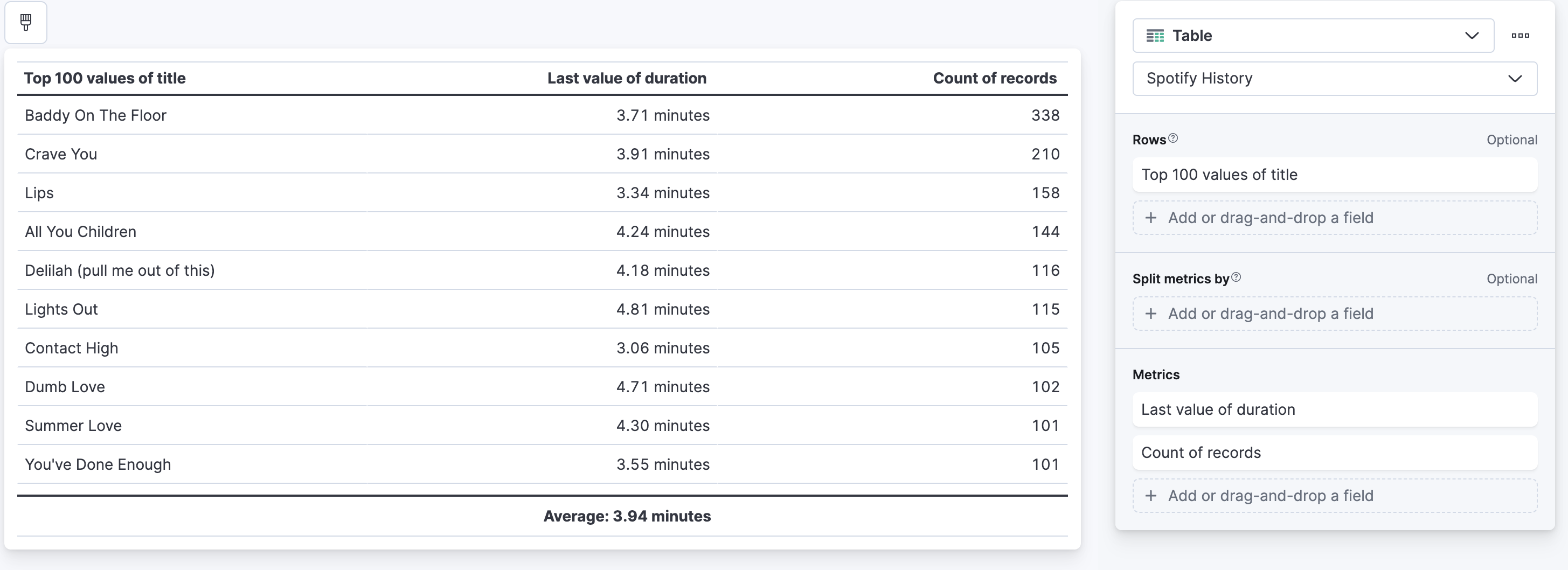
What is the average duration of a song in my top 100?
To answer this question, we can use Lens or ES|QL. Let's explore all three options. Let's phrase this question correctly in an Elasticsearch manner. We want to find the top 100 songs and then calculate the average duration of all of those songs combined. In Elasticsearch terms that would be two aggregations:
- Figure out the top 100 songs
- Calculate the average duration of those 100 songs.
Lens
In Lens, this is rather simple: create a new Lens, switch to a table, and drag and drop the title field into the table. Then click on the title field and set the size to 100, as well as set accuracy mode. Then drag and drop the duration field into the table and use last value, because we really only need the last value of each of the songs' duration. The same song will only have one duration. At the bottom of this last value aggregation is a dropdown for a summary row, select average and it will show it to you.
ES|QL
ES|QL is a pretty fresh language compared to DSL & aggregations, but it is very powerful and easy to use. To answer the same question in ES|QL, you would write the following query:
from spotify-history
| stats duration=max(duration), count=count() by title
| sort count desc
| limit 100
| stats `Average duration of the songs`=avg(duration)
Let me take you step-bystep through this ES|QL query:
from spotify-history- This is the index pattern we are using.stats duration=max(duration), count=count() by title- This is the first aggregation, we are calculating the maximum duration of each song and the count of each song. We usemaxinstead oflast valueas used in the Lens, that is because ES|QL right now does not have a first or last.sort count desc- We sort the songs by the count of each song, so the most listened to song is on top.limit 100- We limit the result to the top 100 songs.stats Average duration of the songs=avg(duration)- We calculate the average duration of the songs.
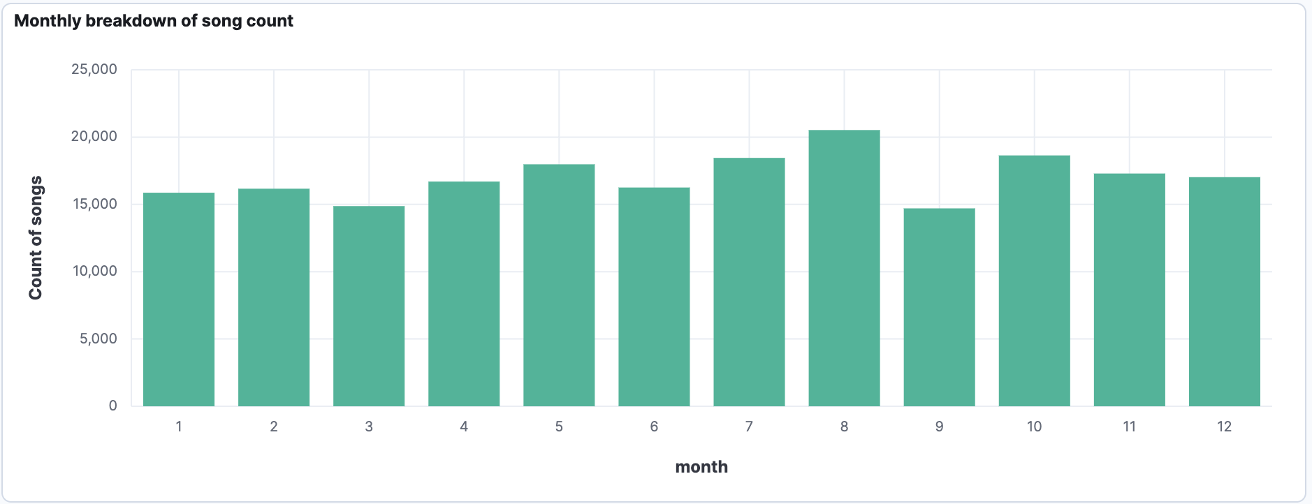
Is a month of particular interest to me?
To answer this question we can use Lens with the help of runtime field and ES|QL. What do we notice straight away, that there is no field in the data that denotes the month directly, instead we need to calculate it from the @timestamp field. There are multiple ways to do this:
- Use a runtime field, to power the Lens
- ES|QL
I personally think that ES|QL is the neater and quicker solution.
FROM spotify-history
| eval month=DATE_EXTRACT("MONTH_OF_YEAR", @timestamp)
| stats count=count() by month
That's it, nothing fancy needed to do, we can leverage the DATE_EXTRACT function to extract the month from the @timestamp field and then we can aggregate on it. Using the ES|QL visualisation we can drop that onto the dashboard.
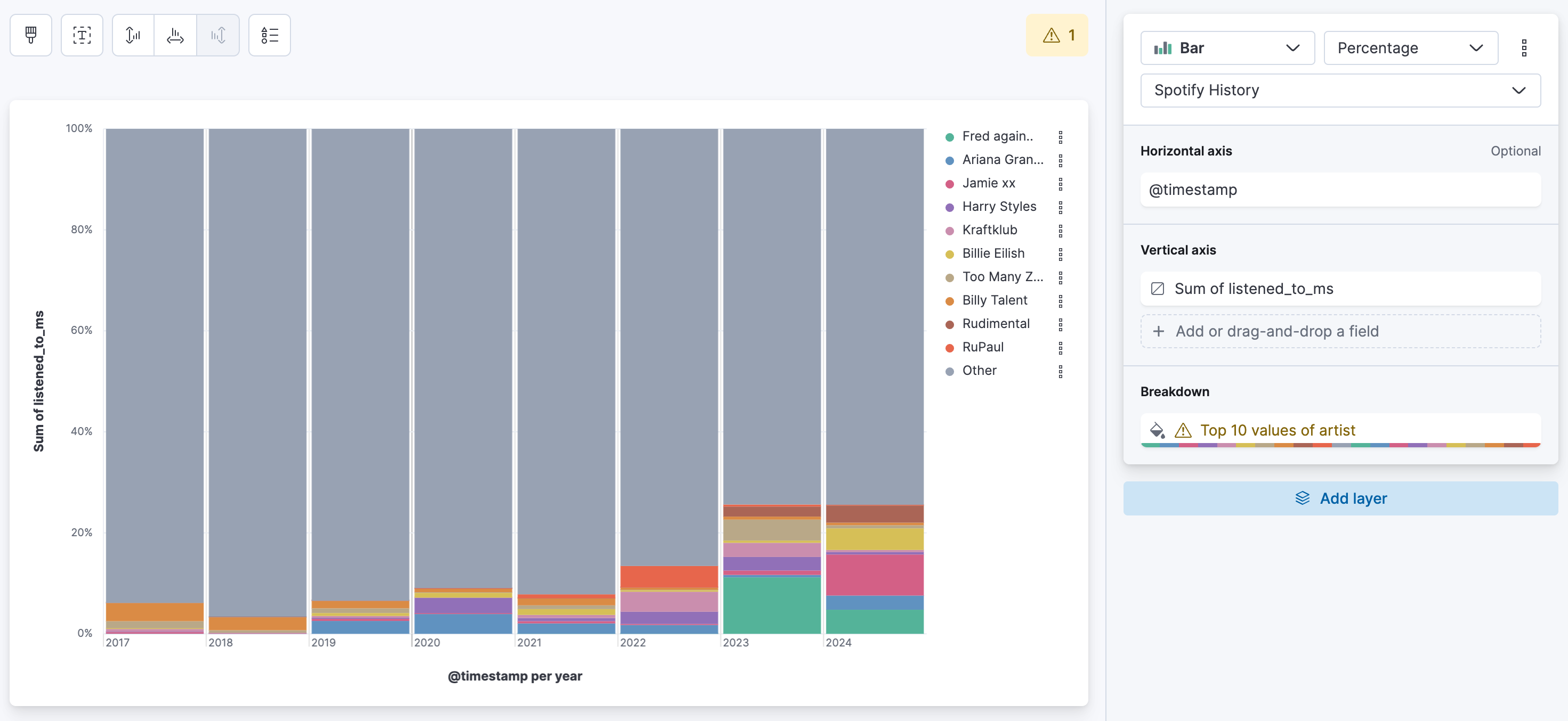
What is my listening duration per artist per year?
The idea behind that is to see if an artist is just a one-time thing or if there is a reoccurrence. If I remember correctly, Spotify only shows you the top 5 artists in the yearly wrapped. Maybe your number 6 artist stays the same all the time, or they heavily change after the 10th position?
One of the simplest representation of this is a percentage bar chart. We can use Lens for this. Follow the steps along:
Drag and drop the listened_to_ms field. This field represents how long you listened to a song in milliseconds. Now per default Lens will create a median aggregation, we do not want that, alter that to a sum. In the top select percentage instead of stacked for the bar chart type. For the breakdown select artist and say top 10. In the Advanced dropdown don't forget to select accuracy mode. Now every color block represents how much you listened to this single artist. Depending on your timepicker the bars might represent values from days, to weeks, to months, to years. If you want a weekly breakdown, select the @timestamp and set the mininum interval to year. Now what we can tell in my case is that Fred Again.. is the artist I listened to most, nearly 12% of my total listening time was consumed by Fred Again... We also see that Fred Again.. dropped a bit in 2024, but Jamie XX grew largely. If we compare just the size of the bars. We can also tell that whilst Billie Eilish is constantly being played in 2024 the bar widthend. This means that I listened to Billie Eilish more in 2024 than in 2023.
What about the top tracks per artist per listening time versus overall listening time?
That's a mouthfull of a question. Let me try to explain what I want to say with that. Spotify tells you about the top song from a single artist, or your overall 5 top songs. Well, that's definitely interesting, but what about the breakdown of an artist? Is all my time consumed just by a single song that I play over and over again, or is that evenly distributed?
Create a new lens and select Treemap as type. For the metric, same as before: select sum and use listened_to_ms as the field. For the group by we need two values. The first one is artist and then add a second one with title. The intermediate result looks like this:
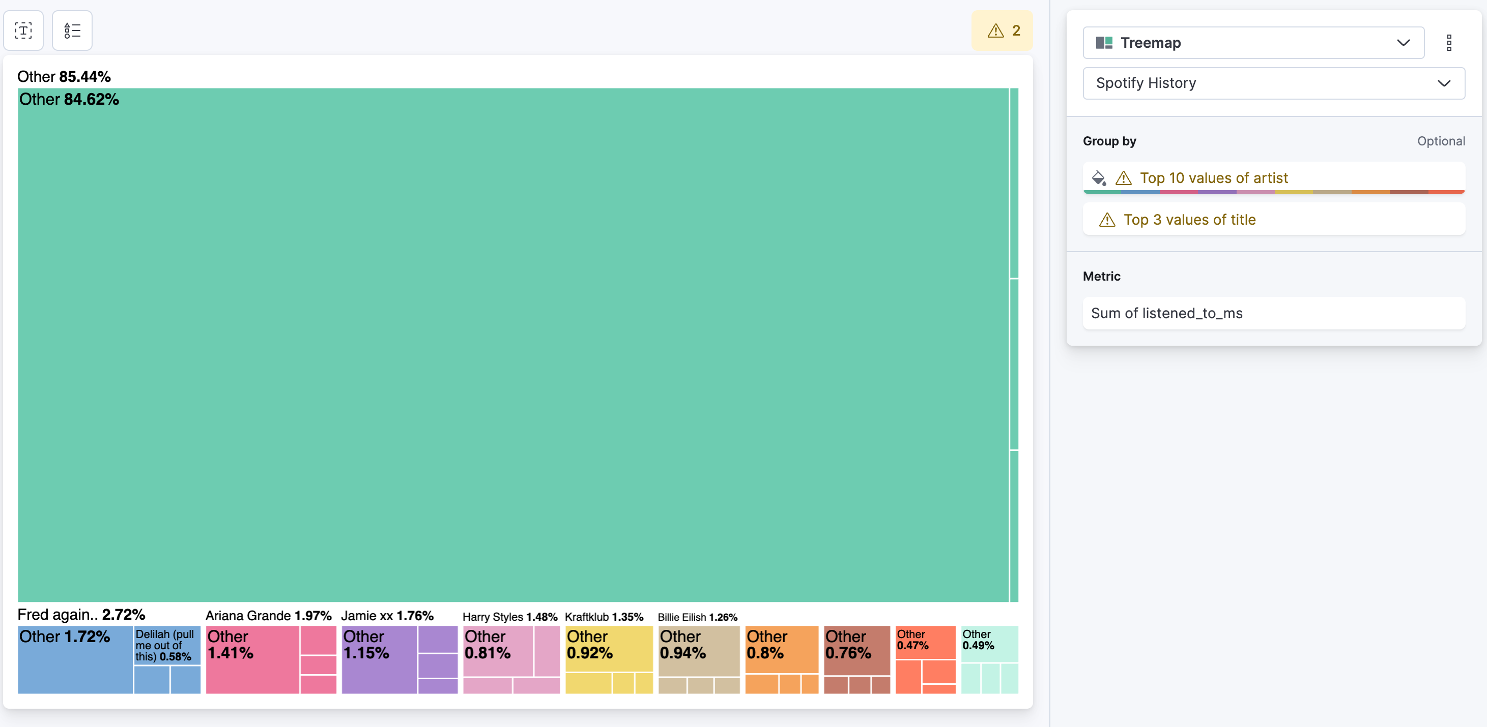
Let's change that to top 100 artists and deselect the other in the advanced dropdown, as well as enable accuracy mode. For title change that to top 10 and enable accuracy mode. The final result looks like this:
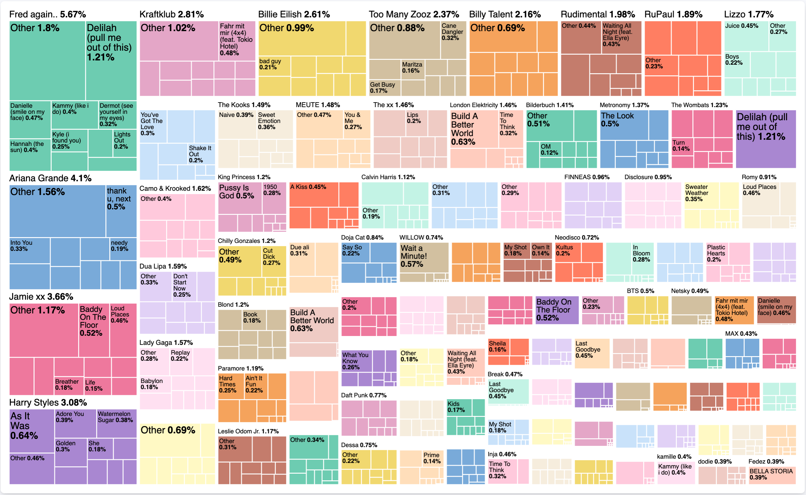
What does this tell us now exactly? Without looking at any time component, we can tell that over all my listening history with Spotify, I spent 5.67% listening to Fred Again... In particularly I spent 1.21% of that time, listening to Delilah (pull me out of this). It is interesting to see, if there is a single song that occupies an artist, or if there are other songs as well. The treemap itself is a nice form to represent such data distributions.
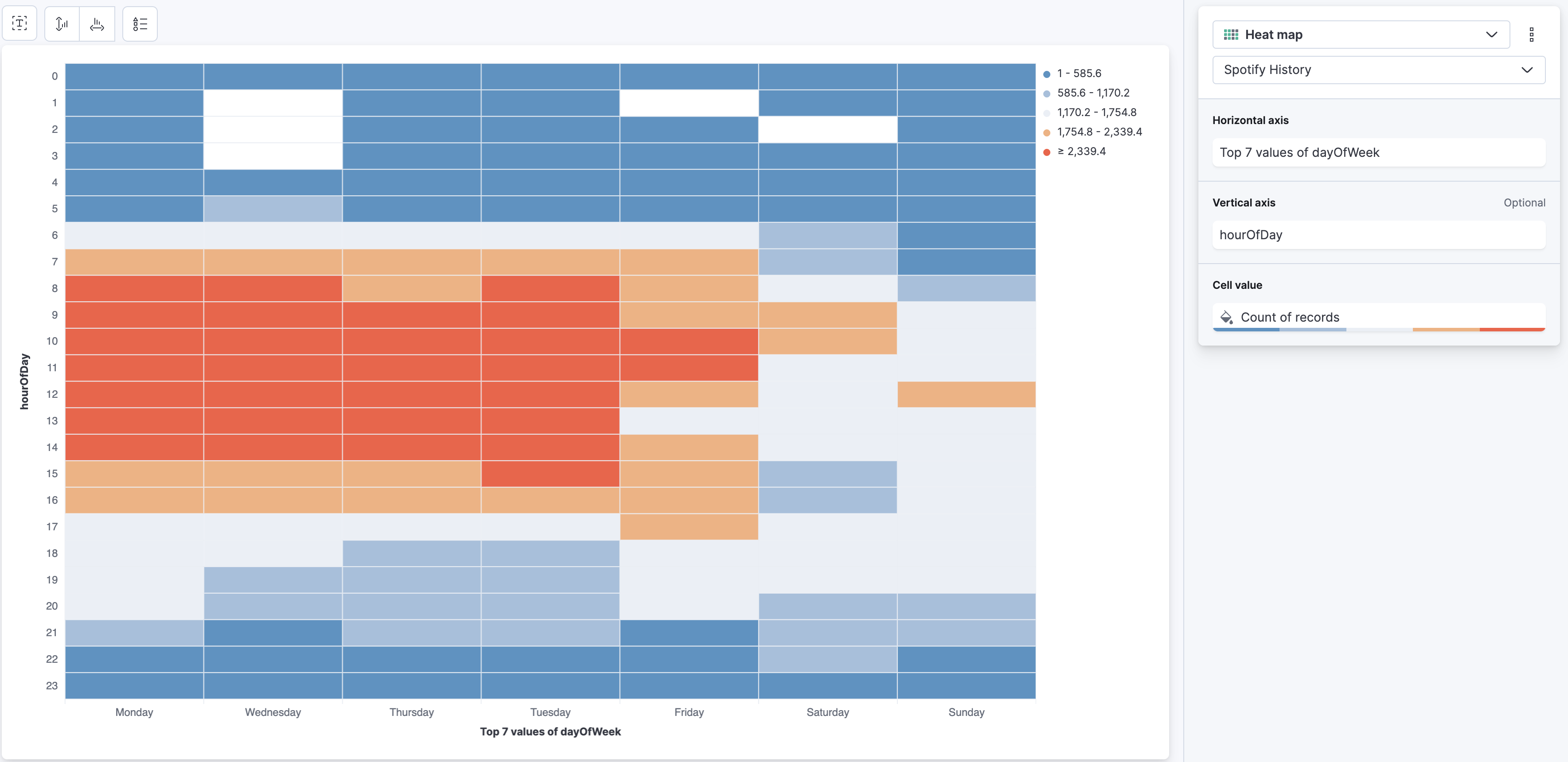
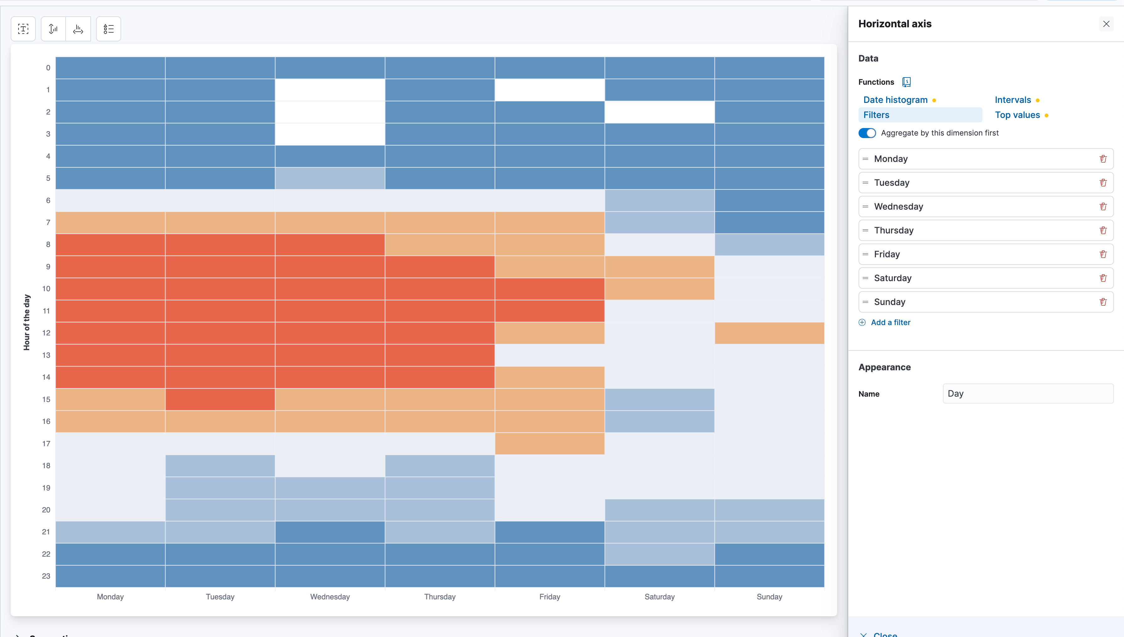
Do I listen on a particular hour and day?
Well, that we can answer super simple with a Lens visualisation leveraging the Heat Map. Create a new Lens, select Heat Map. For the Horizontal Axis select dayOfWeek field and set it to Top 7 instead of Top 3. For the Vertical Axis select the hourOfDay and for Cell Value just a simple Count of records. Now this will produce this panel:
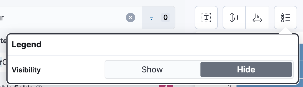
There are a couple of annoying things around this Lens, that just disturb me when interpreting. Let's try and clean it up a bit. First of all, I don't care about the legend too much, use the symbol in the top with the triangle, square, circle and disable it.
Now the 2nd part that is annoying is the sorting of the days. It's Monday, Wednesday, Thursday, or anything else, depending on the values you have. The hourOfDay is correctly sorted. The way to sort the days is a funny hack and that is called to use Filters instead of Top Values. Click on dayOfWeek and select Filters, it should now look like this:
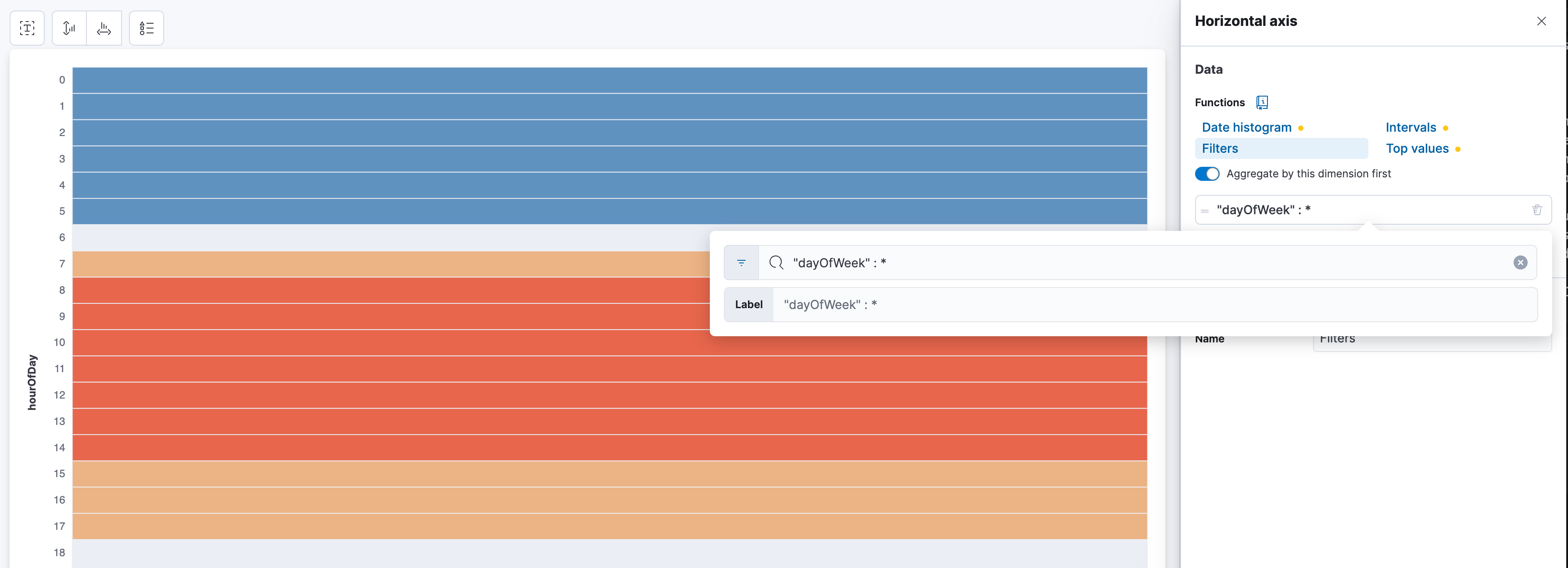
Now just start typing the days. One filter for each day. "dayOfWeek" : Monday and give it the label Monday and rinse and repeat.
One caveat in all of this though is, that Spotify provides the data in UTC+0 without any timezone information. Sure, they also provide the IP address and the country where you listened to and we could infere the timezone information from that, but that can be wonky and for countries like the U.S. that has multiple timezones, it can be too much of a hassle. This is important because Elasticsearch and Kibana have timezone support and by providing the correct timezone in the @timestamp field, Kibana would automatically adjust the time to your browser time.
It should look like this when finalized, and we can tell that I am a very active listener during working hours and less so on Saturdays and Sundays.
Conclusion
In this blog, we dove a bit deeper into the intricacies that the Spotify data offers. We showed a few simple and quick ways to get some visualizations up and running. It is simply amazing to have this much control over your own listening history. Check out the other parts of the series:
- Part 1: How to make your own Spotify Wrapped in Kibana
- Part 3: Anomaly detection population jobs
- Part 4: Detecting relationships in data
- Part 5: Finding your best music friend with vectors
Ready to try this out on your own? Start a free trial.
Want to get Elastic certified? Find out when the next Elasticsearch Engineer training is running!
Related content
AI-powered dashboards: From a vision to Kibana
Generate a dashboard using an LLM to process an image and turn it into a Kibana Dashboard.

April 18, 2025
Kibana Alerting: Breaking past scalability limits & unlocking 50x scale
Kibana Alerting now scales 50x better, handling up to 160,000 rules per minute. Learn how key innovations in the task manager, smarter resource allocation, and performance optimizations have helped break past our limits and enabled significant efficiency gains.

March 3, 2025
Fast Kibana Dashboards
From 8.13 to 8.17, the wait time for data to appear on a dashboard has improved by up to 40%. These improvements are validated both in our synthetic benchmarking environment and from metrics collected in real user’s cloud environments.
Testing DeepSeek R1 locally for RAG with Ollama and Kibana
Learn how to run a local instance of DeepSeek and connect to it from within Kibana.

January 22, 2025
Engineering a new Kibana dashboard layout to support collapsible sections & more
Building collapsible dashboard sections in Kibana required overhauling an embeddable system and creating a custom layout engine. These updates improve state management, hierarchy, and performance while setting the stage for new advanced dashboard features.